My role
As the product design manager, my team and I worked closely with engineering and other cross-functional teams to create a robust design system that maximized efficiency and allowed for quick scalability.
As the Product Design Manager, I had the privilege of spearheading a key and high-profile initiative to develop the design system for Helpful. Working closely with a skilled team of designers, engineers, and a product manager, our mission was to establish a foundation for it. This project encompassed but wasn't limited to defining the design language, creating reusable components, implementing efficient tools, crafting exceptional user experiences, and minimize redundant efforts in reinventing solutions.
Through this case study, I'll share how I contributed and guided my team toward achieving a desirable outcome.
The vision
When CEO Jesse Himsworth and CSO Aaron Gunderson approached me, they had a clear goal: to create a portfolio of websites that would empower users to make informed decisions in a world where that often proved challenging. Their vision extended beyond checking a box or quick profits; they wanted to prioritize being genuinely helpful.
Inspired by their vision, I made a significant career change and joined the team as the third employee alongside Jesse and Aaron. We wasted no time jumping in and wholeheartedly dedicating ourselves to refining and expanding upon that vision.
Our primary objective was to develop an array of content tools, campaigns, audiences, and programs that would come together to provide valuable online shopping experiences. To achieve this, we recognized the critical importance of a robust design system that could quickly adapt to user insights, maintain brand integrity across multiple brands, and minimize redundant efforts. We also understood a system that would be user-friendly and accessible, ensuring a cohesive user experience throughout the site and preventing content inconsistencies.
By staying true to these principles, we were determined to fulfill the vision and change how users navigate the online decision-making world.
The challenge
We recognized the critical need for a complex and highly scalable design system that would serve as the foundation for the company's future portfolio of websites, ensuring consistency, efficiency, and brand integrity. To achieve this, we needed to solve several challenges:
Establishing Brand Identity:
We needed a design system that would allow us to define and establish the unique personality of each brand identity across all future sites in our portfolio. It required a cohesive visual language that would resonate with its target audience and differentiate the company in a competitive market.
Efficiency in Rapid Growth:
With aspirations for rapid growth, we needed an efficient design system that we could quickly expand upon to accommodate new websites. Traditional ad-hoc design practices would hinder scalability, making it essential to establish a core foundation that could support the company's expansion plans.
Consistency in User Experience:
We aimed to provide users with a seamless experience across our portfolio of websites. Without a design system, it would increase human touch points and create potential issues in visual elements and interaction patterns that could erode trust and hinder user adoption.
In creating Helpful's design system, my primary role was to set the team up for success in this design-led effort. To achieve this, I performed the following tasks:
Collaborated in defining the initial roadmap with the CSO and input from our CEO, VP of Content and Creative, and Director of Engineering.
Provided guidance to the design team with feedback.
Recruited and staffed the effort with the appropriate amount of support.
Ensured user research was included in the process.
Aligned the team's goals with key stakeholders.
Integrated the actions of the design team with those of cross-functional stakeholders.
Ensured the design system evolved to meet our changing strategic needs.
Strategic research & determining the MVP: Building a foundation for success
Collaborating with the CSO, I actively created low-fidelity wireframes to explore the concept and structure of our initial page templates for Switchful.com. Soliciting input from various key stakeholders, we engaged with the Director of Engineering and VP of Content and Creative to determine the MVP of our first site and establish the groundwork for our design system. This involved several significant steps in which I played a pivotal role:
Low-Fidelity Wireframes: Close collaboration with CSO resulted in the creation of low-fidelity wireframes, allowing us to visualize and iterate on the design concepts and layout for Switchful.com. These wireframes served as a starting point for gathering feedback and refining our design approach.
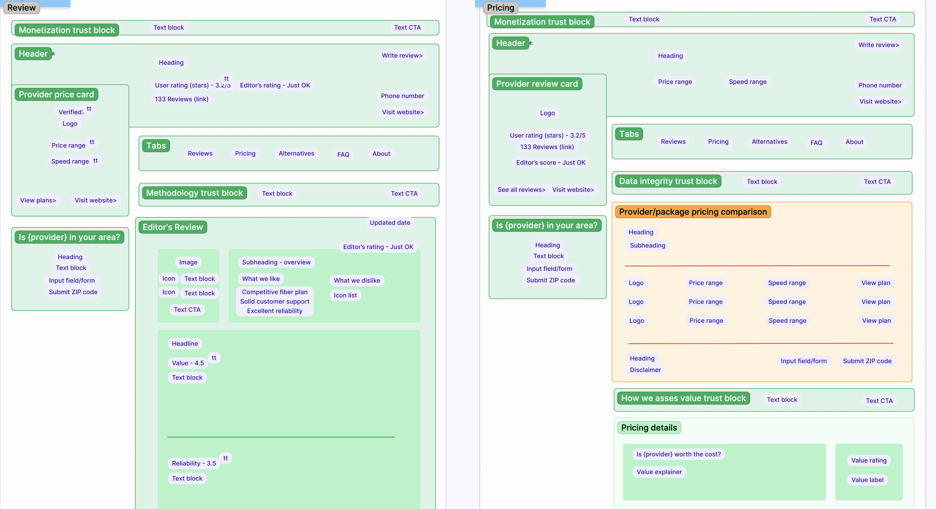
User Research Input: Drawing on user research findings, we ensured that our IA and subsequent design decisions were informed by deeply understanding our target audience's needs and preferences. This user-centric approach guided our design choices to create a more effective and engaging user experience.
Collaboration with Key Stakeholders: Working closely with key stakeholders, including the CSO, Director of Engineering, and VP of Content and Creative, I fostered collaborative discussions to align our vision and goals. By incorporating their expertise and perspectives, we ensured a holistic approach to determining the direction and priorities for our initial site and design system.
Defining the MVP: With the team, we carefully evaluated the features and functionalities that would deliver the most value to our users while aligning with our overarching business objectives. Identifying the core elements required for a successful launch, we determined the MVP of our first site, setting the stage for future iterations and scalability.
By meticulously following these steps, we successfully established the foundation of our design system. This comprehensive process, driven by collaboration, user-centricity, and strategic decision-making, laid the groundwork for Switchful.com Helpful's initial site, paved the way for the foundation of our design system, and set us up for quickly creating future enhancements and expansion.
Creating the design system architecture: Enabling flexibility and efficiency
Understanding previous experience - flaws and pitfalls we wanted to avoid:
In our previous processes, we encountered flaws that we aimed to overcome. We had a large file containing base components (parent component file), which were linked within each site's guide template (or child file). However, the process of manually theming and duplicating components in the child file led to unnecessary efforts and increased complexity for engineering and design teams.
Moreover, relinking the local components after theming created a significant pain point as it separated them from the single source of truth, the parent file. Any updates made to global components resulted in design debt across all sites, requiring substantial effort to maintain files.
Additionally, the handoff of designs to the engineering team and implementing minor updates became time-consuming due to process limitations and backlog issues.
To mitigate these challenges, utilizing design tokens more thoughtfully will significantly enhance efficiency for the design and engineering teams, providing a clear path forward for updates and reducing the maintenance burden.
Knowing where we are going:
We will have multiple brands and product groups within the team org. Knowing this will help create a high focus and a greater sense of ownership over products rather than belonging to one brand.
By doing so, we will create a Global design system and branches. The global system will inform all branches, and each branch will tell the Global system—but branches will not directly inform each other.
Risks we knew to avoid within this type of system:
We remained focused and aligned with our purpose to prevent the system from devolving into a poor structure that would lead to undesirable behavior. We recognized the potential for the system to become siloed if our focus shifted away from the global perspective.
To mitigate this risk, we prioritized the continuous observation and evaluation of the system's branches. Transparency, effective communication, thoughtfulness, and purposefulness were vital components in our approach. We ensured that every decision we made stayed true to our north star, providing a cohesive and unified design system.
We successfully maintained a scalable and well-functioning design system by diligently adhering to these principles. Our commitment to transparency, communication, and purpose allowed us to navigate challenges and evolve the system in a manner that aligned with our overarching goals.
Establishing the foundation: Defining foundational styles for brand adaptability
To create styles that could adapt to any brand, I quickly understood that we would need to create a headless design system to pair with the headless CMS the engineering team was building. I fostered collaboration between design and engineering by holding frequent touchpoint discussions with ICs and leadership, where we worked closely to determine a set group of design tokens that would allow flexibility in encompassing each brand's unique personality. The foundational styles that would shape our design system included:
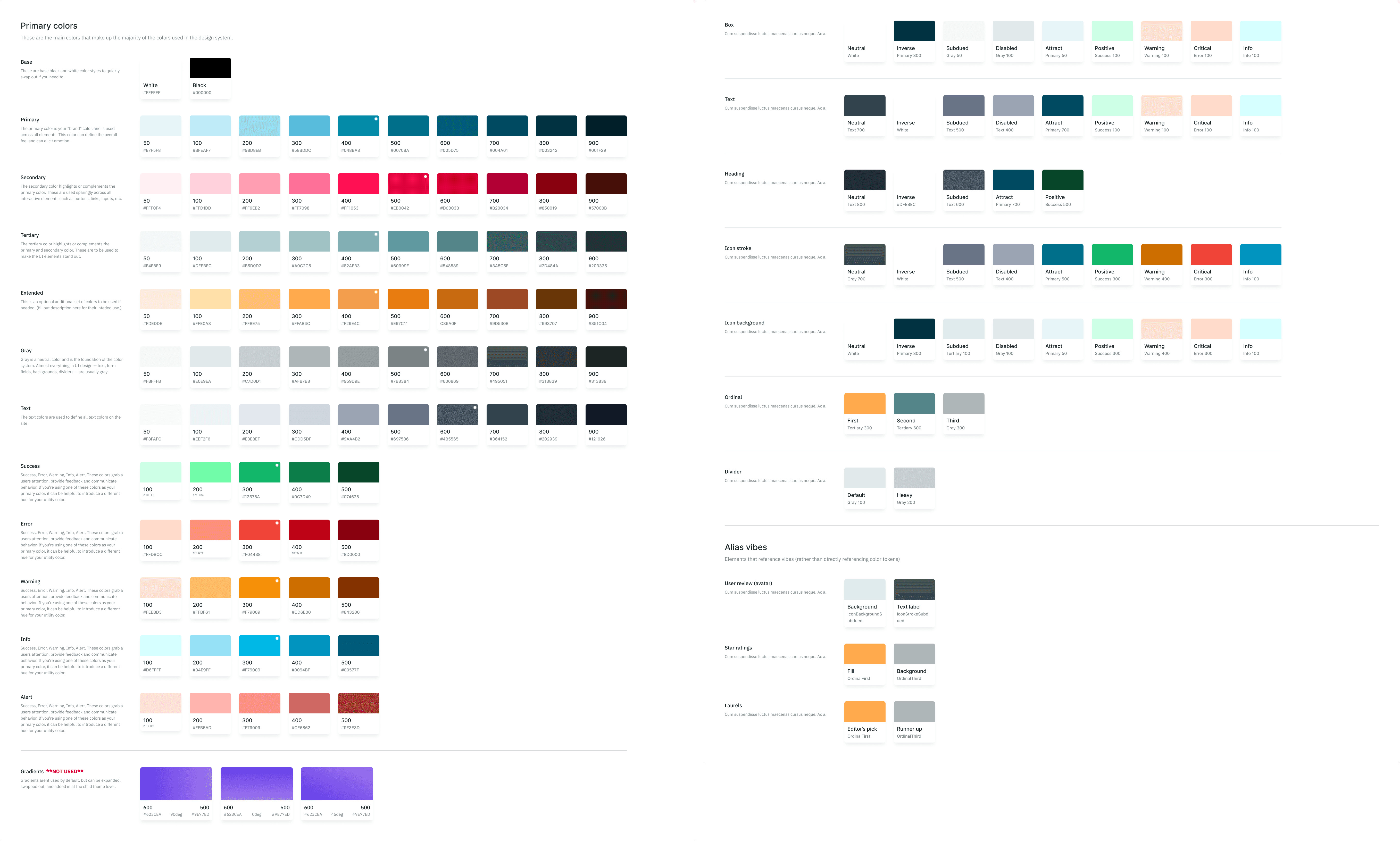
Colors and schematic relations: We meticulously crafted a diverse color palette and established meaningful relationships between colors. By defining semantic relations, we ensured consistent and harmonious color usage across different brands while allowing distinct brand identities to shine through.
A flexible spacing system: Allowed consistency in the layout of design elements while accommodating different content types and feelings of any brand's look and feel.
Performance-driven typography: Developing a strong best practice for performance-driven typography ensured that the sites would be optimized for speed and accessibility.
Defining these foundational styles and best practices with design tokens provided the building blocks for creating a consistent, scalable brand identity by allowing the organization to control the look and feel of every site in the portfolio.
Component creation: elevating editorial-based affiliate marketing sites
While many design systems for editorial-based affiliate marketing sites follow a similar structure (including pricing cards, tables, callout sections, and the like), we recognized the need for something different. We aimed to develop a system capable of seamlessly integrating a range of data sourced from APIs and a central database, enabling the effortless generation of dynamic pages tailored to unique geographic locations. We also aimed to provide easy product comparison options and highly credible reviews from users and seasoned researchers. This approach allowed us to create a personalized shopping experience, presenting all the relevant and vital information in a single, convenient location.
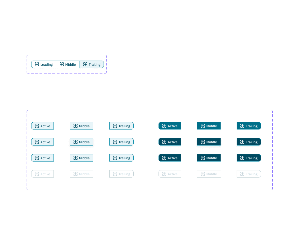
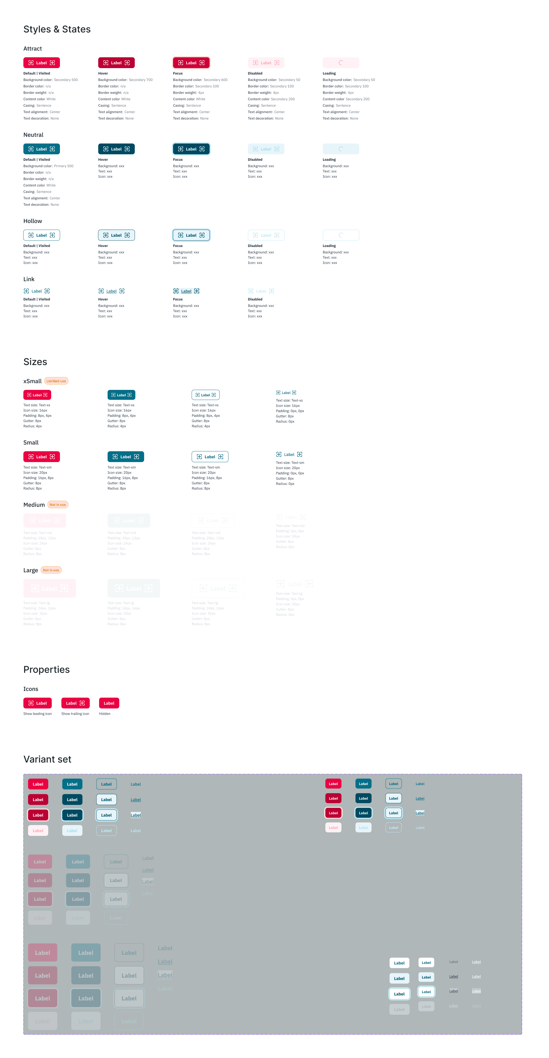
Below is a small sample of some components that lead to the big picture.
The page templates: Bringing the vision to life
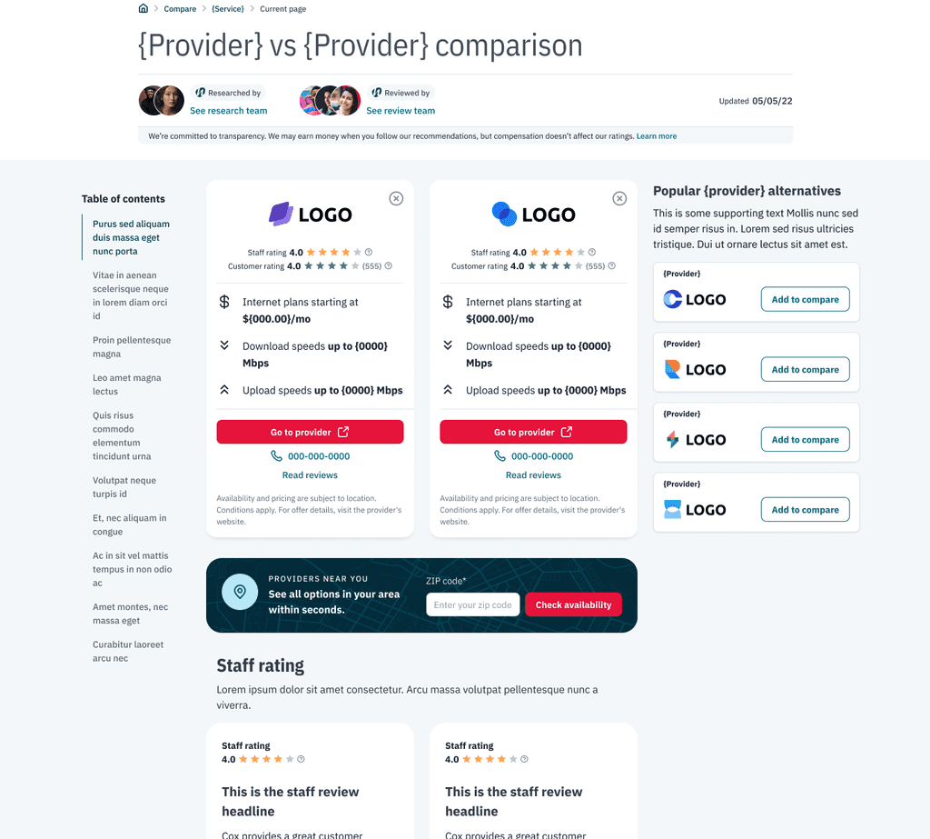
This was the pivotal moment where action and implementation took center stage. Leading my team, we delved into the page wireframes with a shared commitment to our vision, agile methodologies, collaboration, and unwavering dedication.
Creating dynamic page types necessitated a heightened level of collaboration between design and engineering, which I facilitated by closely partnering with the Director of Engineering and Product Manager. Together, we ensured the seamless integration of design and technical aspects, Facilitating a cohesive collaboration.
In close collaboration with other cross-functional team members, we adeptly translated content types into a user-centered experience on the screen. We crafted compelling and intuitive interfaces by drawing insights from various stakeholders and aligning them with user needs.
The successful culmination of this process relied on meticulous planning, strategic decision-making, and outstanding teamwork. Our collective efforts seamlessly merged design, engineering, and content to deliver a cohesive and impactful user experience.
The summary
In just seven short months, we saw the fruit of labor when our first site Swithful.com launched.
The design system truly excelled in creating dynamic page types. Through numerous brainstorming sessions, meticulous thought exercises, collaborative efforts, and strategic guidance, I led my team in crafting a solution that seamlessly integrated all the planning, research, and execution. Together, we developed a comprehensive framework that effectively brought together various elements and ensured the successful creation of a versatile and engaging website.


