My role
As the Senior Product Designer, I collaborated closely with our Creative Director, now Head of UX and Product Design at US News, to spearhead creating and evolving a comprehensive Design System that would revolutionize the user experience across the entire Clearlink portfolio. This project encompassed creating a shared design language and migrating 12 different websites from different CMSs into one unified system.
Upon assuming the role of Product Design Manager, I embraced the opportunity to transition from a peer position to a leadership role. With a clear vision, I set out to empower our talented team and elevate the Design System and each website under the Clearlink umbrella—the exciting journey called for strategic thinking, effective communication, and a deep commitment to excellence.
This case study highlights my significant contributions and guidance in leading the team toward a positive result.
The vision
We focused on building, refining, and expanding a Design System to ensure consistency, efficiency, and brand integrity across all 12 websites in our portfolio. We prioritized creating a solid foundation and took a deliberate and collaborative approach. Through iterative design iterations and continuous feedback loops, we developed a comprehensive system. Scalability was a key consideration, anticipating future growth and accommodating new websites seamlessly. We documented the system's guidelines and best practices, providing designers and developers with valuable resources for effective implementation. Regular reviews and assessments ensured the system's continuous improvement while maintaining a cohesive brand experience throughout our digital ecosystem. The result was a scalable and robust Design System that enabled us to deliver exceptional user experiences with deliberate intent.
The challenge
The existence of 12 different sites and 12 other Content Management Systems (CMSs) resulted in significant challenges of duplicative work in design and engineering. The absence of a shared language and systematic approach led to inefficiencies and inconsistencies. To address this issue, there was a need to create a design system with a global component file that could centralize components, enable updates at the parent level, and potentially allow targeted updates at the child level when necessary.
In creating and solving the challenges we faced while building this design system, my primary roles were:
As a Senior Product Designer, my primary roles involved collaborating on improving the user experience, contributing to creating a unified design system for multiple websites, and ensuring consistency and user satisfaction.
As a Product Design Manager, the focus was on empowering the team, fostering innovation, optimizing workflows, and guiding the growth of the design system.
Primary roles as a Senior Product Designer:
Collaborating closely with the former Creative Director and other Design Managers.
Adopting a shared design language and assisting in migrating 12 different websites from different CMSs into one unified system.
Refining and expanding the Design System to establish a strong foundation for consistency, efficiency, and brand integrity.
Assisting in the transformation of the Clearlink portfolio through the implementation of the Design System.
Ensuring a consistently delightful and intuitive user experience across all websites.
Empowering users through shared design patterns and interactive components.
Primary roles as a Product Design Manager:
Empowering and elevating the Design System and websites under the Clearlink umbrella.
Driving strategic thinking and effective communication to achieve excellence.
Fostering a culture of innovation and continuous improvement within the team.
Streamlining workflows and optimizing collaboration between designers, developers, and key stakeholders.
Cultivating a shared language that transcends individual roles and promotes collaboration.
Improving team efficiency, productivity, and collaboration through the Design System.
Guiding the future growth and adaptation of the Clearlink Design System.
Establishing a solid foundation: Building blocks of our design system
Under the leadership of my Creative Director, I contributed to crafting the base of our design system that harmonized visual elements, typography, colors, and interactions.
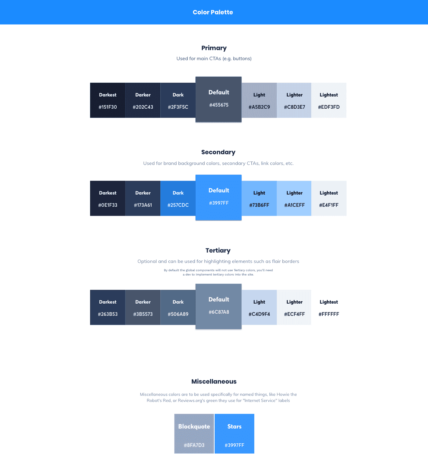
We curated components that evoked trust and reliability. We carefully selected typography best practices to make for more performative sites and reduce file size. We Established a base for colors that would be enough to let any brand embody its essence. Purposeful interaction patterns and micro-interactions helped make a delightful, seamless, intuitive user experience.
Meticulous attention to detail and purposeful design choices elevated the user experience and established a strong foundation for future growth.
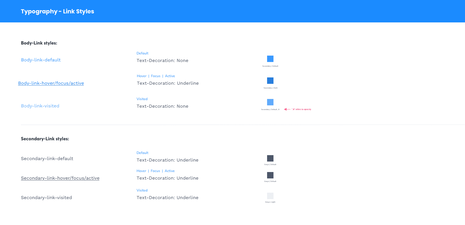
Below is a small sample of some of the design system foundations.
Implementing the design system: migrating and expanding for a unified UX
During the migration process, as an IC, I took ownership of the redesigns for two key sites: asecurelife.com and business.org. Both sites underwent major overhauls to incorporate the new design system and WordPress-based CMS. These redesigns marked significant milestones in our implementation journey.
By leveraging my expertise and adhering to the principles of our design system, I crafted captivating and modern designs for asecurelife.com and business.org. Integrating the design system and CMS streamlined content creation and management processes, resulting in improved workflow efficiency and a consistent user experience across the sites.
These websites' successful migration and redesign paved the way for further expansion within our portfolio. Armed with valuable knowledge and experience, we extended the reach of our design system to other websites, enabling them to benefit from the cohesive brand identity, streamlined user experience, and efficient content management facilitated by our design system and CMS integration.
The migration of asecurelife.com and business.org demonstrated our ability to implement and adapt the design system effectively. It also showcased our proficiency in integrating modern CMS solutions. These early successes provided the foundation for future endeavors, validating the scalability and effectiveness of our design system approach.

Shortly after our successful work on asecurelife.com and business.org, I significantly redesigned our third site, reviews.org. As this project's sole designer and owner, I oversaw every aspect of the redesign. Reviews.org is a massive site encompassing both a US and AU version, which presented unique challenges requiring meticulous documentation, careful planning, and close collaboration with our team in Australia.
During this time, I was promoted to Product Design Manager while actively involved in IC work. This meant taking on the responsibility of leading the largest migration project to date while simultaneously adapting to my new leadership position. As one of my first tasks, I focused on hiring a new designer to fill my previous role. Navigating the hiring process can be challenging, but I was fortunate to find and recruit a talented mid-level designer who seamlessly joined our team and excelled under my guidance during this pivotal moment.
The migration of reviews.org demanded extensive effort and dedication, requiring coordination and collaboration across multiple teams. As a Product Design Manager, I ensured a smooth and successful transition, combining my newly acquired leadership skills with my expertise as a designer. This experience allowed me to grow personally and professionally while also providing an opportunity to mentor and empower a talented designer to contribute to our collective success.
Navigating the migration to enable a seamless UX across brands
We quickly realized the significant time investment and complexity involved in the migration process, which began to grow exponentially due to various factors. To tackle this challenge, we proactively developed a comprehensive set of best practices to streamline and ensure the success of the migration process.
The first crucial step was to conduct a site audit, leveraging scraping techniques to extract data from the existing site in the old CMS. This audit allowed us to identify the components present on the current website and determine their compatibility with the already-built components. We relied on the engineering team for this task, who executed the initial scrape. While their efforts proved largely effective, we recognized the need for a human touch to handle certain intricacies.
I facilitated a collaborative meeting involving the site's designer and cross-functional stakeholders to address this. Together, we conducted a comprehensive manual review, taking into account the results obtained from the engineering team's code scrape. This meeting served as an opportunity to analyze and reconcile any minor discrepancies between components carefully. We encountered cases where multiple components performed similar functions but were built with different underlying code. Thus, this meeting was critical to evaluate whether we could make concessions by migrating specific components to existing ones or if it necessitated the creation of new components within our design system.
Upon completion of the meeting, we had a clear list of components deemed suitable for migration and a separate list of net new components that needed to be redesigned, developed, and integrated into our design system. This milestone marked an important turning point, as it allowed us to provide the engineering team with precise guidance on which components were ready for migration and which required additional work. Additionally, I played a pivotal role in establishing a well-defined timeline and prioritizing these tasks, ensuring their smooth inclusion in our development roadmap. Meanwhile, the IC designer focused on bringing these components to life within the design system, incorporating them seamlessly into the overall framework.
Over three years, our dedicated efforts and meticulous approach paid off, as we successfully completed the migration process for 10 of the 12 sites within our portfolio. This achievement solidified our expertise in handling large-scale migrations and demonstrated our commitment to delivering exceptional user experiences across multiple brands. Shortly after this significant accomplishment, I embarked on a new professional journey, joining the Helpful team to expand my skills further and contribute to their innovative projects.
Unlocking success: The impact of a scalable design system
Throughout this journey, I witnessed firsthand the profound impact of a robust and scalable design system on an organization's success. Our collective efforts elevated the Clearlink brand and significantly improved our team's efficiency, productivity, and collaboration. We built a shared sense of pride and achievement by empowering each team member to take ownership and contribute to the design system's evolution.
Overall the lessons learned, and the culture of excellence we cultivated will serve as a solid foundation for future endeavors. It was a rewarding experience to witness the transformative power of a well-crafted design system and its positive ripple effect on both the team and the end-users we served.
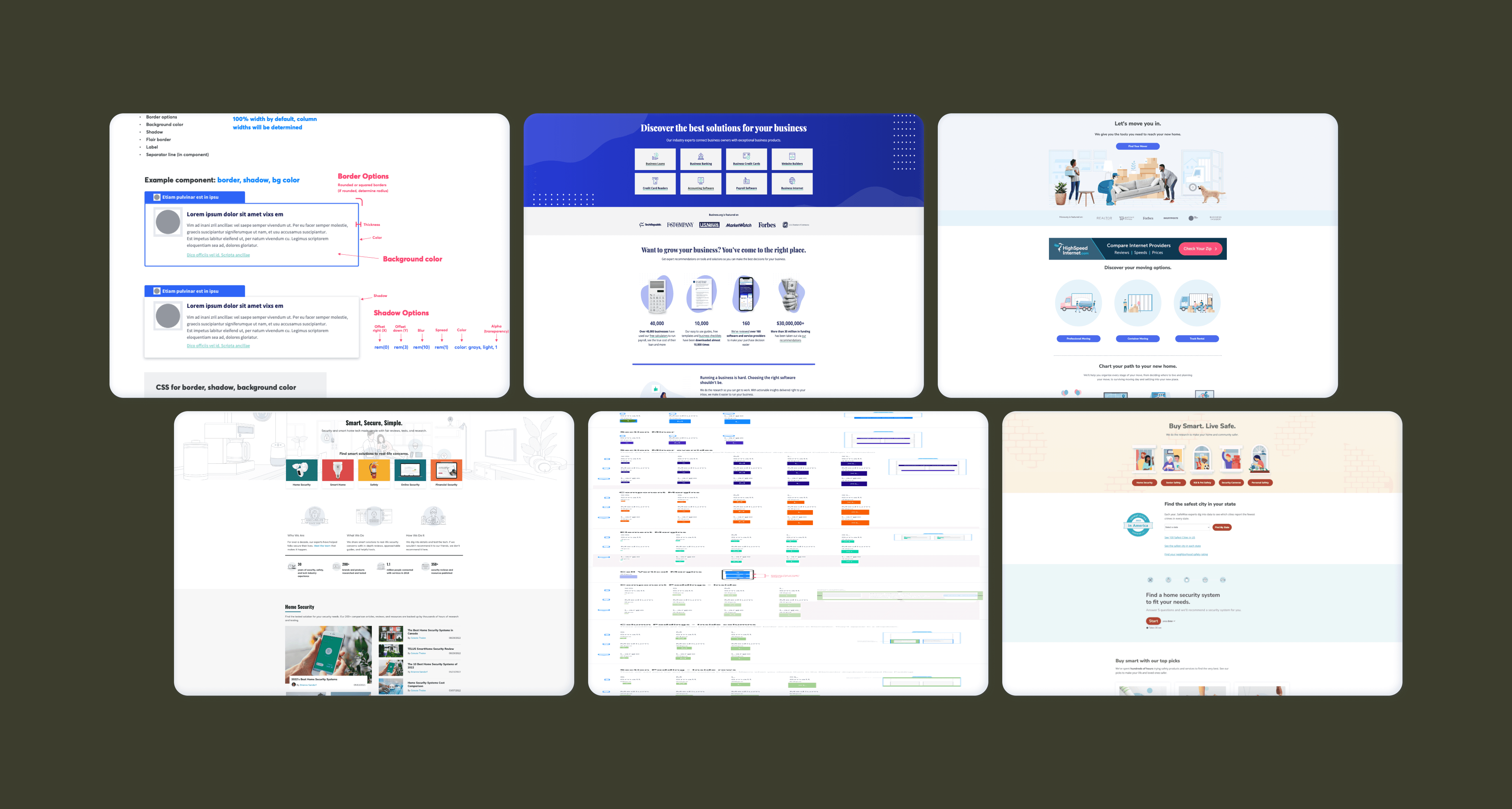
If you want to see more of the sites and how this design system is delivered, you can look at some sites below.


